Maxtins: A Futuristic Display Font for Bold Digital Identity
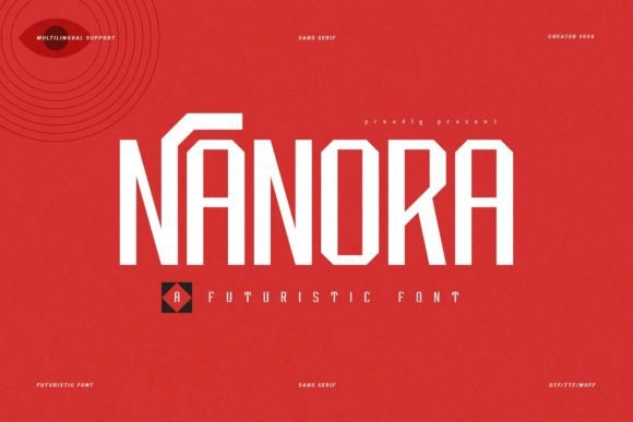
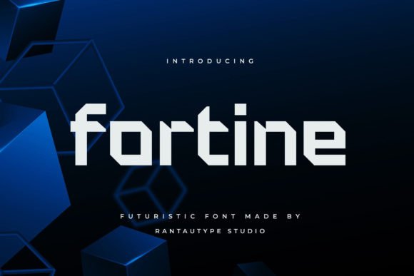
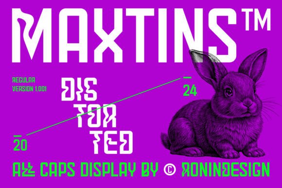
As a UI designer who ships landing pages, SaaS dashboards, and conversion-optimized storefronts, I reach for display fonts like Maxtins when the project demands instant recognition—when the first 3 seconds on screen must communicate innovation, confidence, and controlled disruption. Maxtins isn’t built for paragraphs or navigation menus. It’s engineered for impact: sharp angles, intentional distortion, and a high-tech rhythm that feels both algorithmic and human-crafted.
This display font thrives where hierarchy needs reinforcement—not through size alone, but through typographic contrast. Its jagged terminals and asymmetrical weight distribution create visual tension that guides the eye upward, inward, or toward your primary CTA. On a product landing page, pairing Maxtins with a neutral sans serif (like Inter or Manrope) instantly establishes a clear voice: the headline asserts authority; the body copy delivers clarity. That dynamic is essential for digital readability—not just legibility at small sizes, but how users *scan*, *pause*, and *act*.
Use Maxtins where brevity meets intention: hero section headlines, section dividers (“Our Tech Stack”, “Launch Ready”), button labels on premium-tier CTAs (“Get Early Access”), or logo lockups for tech-forward brands. It works exceptionally well over dark gradients or subtle noise textures—its contrast holds up without needing heavy outlines or shadows. On light backgrounds, ensure sufficient letter spacing (tracking ≥ 50–80 units) to prevent visual crowding, especially in all-caps usage.
For mobile responsiveness, limit Maxtins to headings above 24px on desktop and no smaller than 20px on mobile viewports. Avoid using it for inline links, form fields, or microcopy—its personality overwhelms functional text. Instead, deploy it as a strategic accent: a single animated headline on a course sales page, the title treatment in an app onboarding flow, or the bold header atop a portfolio case study. In each case, Maxtins signals that this isn’t generic—it’s curated, future-facing, and intentionally distinct.
Readability isn’t compromised by Maxtins—it’s redefined. Unlike decorative script or handwritten fonts, Maxtins maintains strong character distinction even at reduced weights and moderate scaling. Its uppercase-heavy design avoids lowercase ambiguity, making it highly scannable in banner ads or social media graphics. That said, avoid stacking multiple Maxtins variants in one layout. Stick to one weight (typically Bold or Black) and rely on scale, color, and spacing to create variation. Overuse dilutes its power—and risks appearing gimmicky rather than grounded.
Font pairing is where Maxtins shines brightest. Pair it with a clean, highly legible sans serif for body text—think Inter, IBM Plex Sans, or Work Sans. These pairings support accessibility while preserving brand tone: Maxtins delivers the spark; the sans serif delivers trust and flow. For editorial or boutique brand sites, try a restrained serif like Playfair Display (light or regular) for subheads—its contrast with Maxtins’ geometry creates sophisticated tension without competing for attention.
In real-world projects, Maxtins anchors identity across touchpoints. A creative agency uses it for their site’s main navigation labels and project category tags—consistent, memorable, and unmistakably theirs. A hardware startup deploys it across product launch banners, firmware update modals, and investor pitch decks—reinforcing technical precision and forward motion. An online coaching platform applies it only to module titles inside their learning dashboard, creating rhythmic visual breaks that improve content digestion and reduce cognitive load.
Before integrating Maxtins into production, verify webfont availability: check whether it includes WOFF2 files (for optimal compression), supports variable font axes (if offered), and includes basic Latin-1 multilingual characters (accents, ñ, ü, etc.). Most licensed versions include OpenType features like stylistic alternates and ligatures—use these sparingly in hero text to add subtle polish, not clutter. Also confirm licensing scope: commercial use for client websites, SaaS platforms, e-commerce stores (Shopify, BigCommerce), digital templates (Figma UI kits), and branded assets (social banners, email headers) typically requires an extended license—not just a desktop-only purchase.
Maxtins performs best when treated as a design system element—not decoration. Its value isn’t in how “cool” it looks in isolation, but how effectively it elevates your layout’s purpose. Does it make your CTA feel more urgent? Does it help users instantly recognize your brand across devices? Does it reinforce your product’s positioning—whether that’s AI infrastructure, immersive design tools, or next-gen wellness tech? If yes, Maxtins earns its place. If you’re trying to soften a message or build warmth, reach for something else. This is a display font with conviction—not versatility.
Finally, test Maxtins in context—not just in Figma or Adobe Fonts—but in live browser environments. Check rendering on Safari (especially older iOS versions), observe hinting behavior at 16–18px on retina displays, and validate contrast ratios against WCAG 2.1 AA standards when used over images or gradients. When implemented with intention, Maxtins doesn’t just sit on the page—it shapes perception, strengthens recall, and quietly lifts conversion rates by aligning visual language with user expectation.